Branding The Mind Body Project has been a consistent challenge for us. How can a team of creative and vibrant globe trotters possibly narrow down our worldview, passion and identity into a few shapes and colors? What will be left out? What will be included?!
It has taken over two years, and we're still working on it., but we recently pushed ourselves to focus and communicate our message by means of a logo. It was a fascinating learning process. This certainly isn't an endorsement for our "branding model," but it's a brief view into the journey of a working logo.
The Mind Body Project Branding Brief: Mindfulness for REAL people
The Words: Bold, Thriving, Mindful, Science, Brains, Bodies, Movement, Inclusive, Compassionate, Smile-Infused, Community, Strong, Dynamic, Modern, Motivating, Bold, REAL
The Colors:
Teal: Alternative growth + change
Yellow: Motivation, Inspiration, Energy
Reddish pink: Bold, outspoken, against the norm
The concept: A bold, dynamic but fun brain on top of a strong, stable body in a power stance that could represent any person . Bold/sturdy/stable body and with sharp lines.
The Image Evolution:

Previous logo. Desire to add more design elements including an image, creative text and updated colors.
First concept received from graphic design company we found on Instagram.
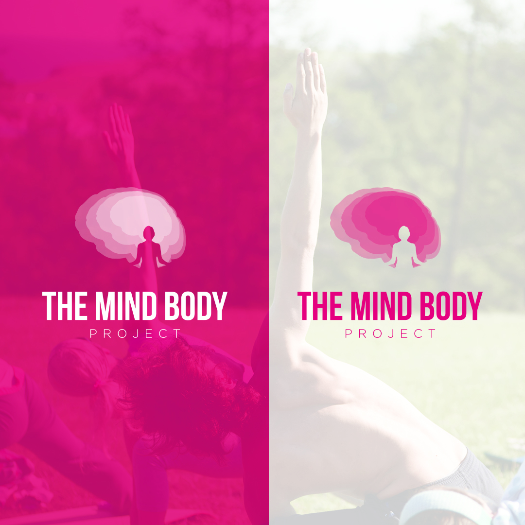
Oh lord, it's so pink...and maybe a portal into an alien brain-snatching invasion?
Liking the boldness of the concept, but it's way too similar to other brands in our field.

Still. hot. pink. Why? Whyyyy?
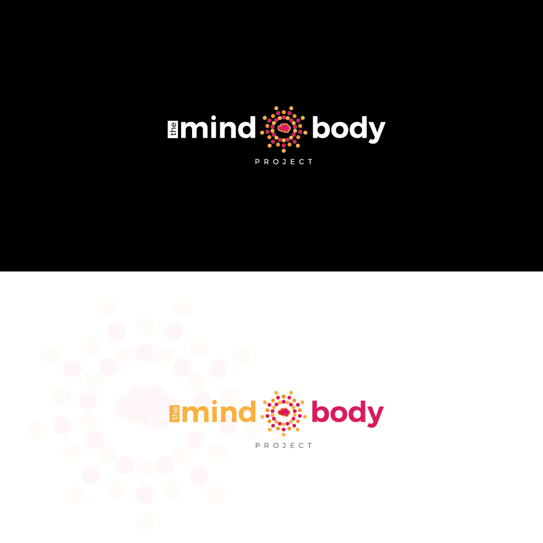
Too dancey, brain looks like a cloud, but liking the text elements.

Alright, alright. We're getting there. Let's change up the text a little and make the brain looks a little more realistic but still fun...and I think we need to outline the features of this power stance.

Concept is on-point but colors are off. We have run out of revisions with the company...Natalie to the rescue.

BOOM, that'll do. (For now.) Comments have been enabled on this post, feedback awaits!
Now to change the hundreds of instances we have used the old logo...